Ionuț Costinel NICA and Simona Liliana CRĂCIUNESCU (PARAMON)
Bucharest University of Economic Studies, Bucharest, Romania
Volume 2020,
Article ID 359361,
Journal of Eastern Europe Research in Business and Economics,
17 pages,
DOI: 10.5171/2020.359361
Received date: 2 March 2020; Accepted date: 1 September 2020; Published date: 4 December 2020
Academic Editor: Georgescu Irina Alexandra
Cite this Article as:
Ionuț Costinel NICA and Simona Liliana CRĂCIUNESCU (PARAMON) (2020)," Data Mining Techniques in The Analysis of The Causal Factors Regarding Innovation in The Private Sector at The Level of Europe", Journal of Eastern Europe Research in Business and Economics Vol. 2020 (2020), Article ID 359361, DOI: 10.5171/2020.359361
The rapid pace of growth of data quantities and the need to make sense of the information chaos have made it possible to introduce a new concept that encompasses these two aspects. Living in a world where we can identify a wealth of data and information, the data mining technique is a useful tool for analyzing a large data set. In this article, a data set has been analyzed in order to allow the observation of how innovation has different causal factors in the private sector. The analysis was carried out in several countries in Europe. The first step of the analysis was data processing and descriptive statistics. The next step was to analyze the main components to reduce the dimensionality of the analyzed data set. The third step of the analysis is the cluster technique in order to classify the variables into classes so as to ensure a minimum variability within the class and a maximum variability between classes. The last part of the analysis proposed in this article was the use of classification trees to see what factors influence an individual’s decision to become an entrepreneur.
Keywords: Data Mining, Private Sector, R Studio, Opinion Influence, Big Data.
Introduction
The present work was elaborated to apply the reduction of the dimensionality of a certain data set in order to allow the observation of the way in which the innovation in the private sector, at the level of Europe (by country), has different causal factors (direct or indirect) that allow it to grow and develop, or otherwise, to decrease. These factors can be: the share of the population with higher education, the share of foreign doctoral students, the share of companies that have high-speed internet access, public or private expenses on research, the share of companies offering training or innovating, the number of publications resulting from public sector collaboration, and private sector investments in research and higher education.
The rapid pace of growth of data quantities and the need to make sense of the information chaos have made it possible to introduce a new concept that encompasses these two aspects; namely the Big Data, the concept that refers to the exponential growth of structured and unstructured data.
Methodology
Big Data is any collection of datasets that are so big and complex that can no longer be processed using traditional means. Forrester analysts described the Big Data phenomenon as “the ability of a company to store, process and analyze all the data needed to function efficiently, make informed decisions, reduce risks and serve the needs of customers.”
In 2001, analyst Doug Laney gave a definition of the concept of Big Data that included the three V’s:
Volume (if in 2000, a regular computer would have 10 GB of storage space, now Facebook generates 500 terabytes of new data daily, a Boeing 737 generates 240 terabytes during a secure flight over the United States, etc.)
Velocity (user behavior can be reflected by accessing advertisements and various sites, and this happens quickly. Online game systems host millions of competing users, each producing a lot of data every second);
Variety (Big Data does not only refer to numbers, character strings and login data, but also includes audio and video data, unstructured data from social media sites, and 3D data. The latter making databases and traditional unprepared analytic tools. Traditional databases were designed to operate on a single server, thus being expensive and finite in terms of capacity in the Big Data context).
SAS specialists added two other dimensions, namely variability and complexity. The first term refers to the inconsistency of the data, and the second refers to the existence of multiple sources of data that make their correlation necessary. Thus, Big Data refers to any complex set of unstructured data, which can no longer be managed with the help of traditional databases, with the difficulties of storing, analyzing, manipulating data, viewing and sharing.
The term Big Data was first mentioned in August 1999, when Steve Bryson et al. published the article “Visually exploring gigabyte data sets in real time” in “Communications of the ACM”. One of the chapters of the paper is called “Big Data for scientific visualization”[2].
In October 2003, Peter Lyman et al. of the Berkeley University published the paper “How much information?”. It tries to quantify the total of new and original information created annually in the world and kept in physical format (books, magazines, etc.), on DVDs and CDs or on magnetic disks. It is found that in 1999, around 1.5 exabytes of unique information were produced worldwide, that is to say about 250 megabytes produced by one person. [3]
R is a software that works on the basis of a programming language, providing a variety of statistical analysis and data mining techniques. The popularity of this software has increased lately due to the variety of facilities it offers in terms of analysis techniques. Thus, R encompasses linear and nonlinear models, classical statistical tests, time series analysis techniques, classification methods, clustering and so on. Through the packages that add functions to the program, the facilities are constantly increased.
Results and Discussions
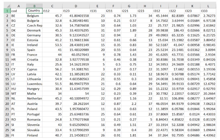
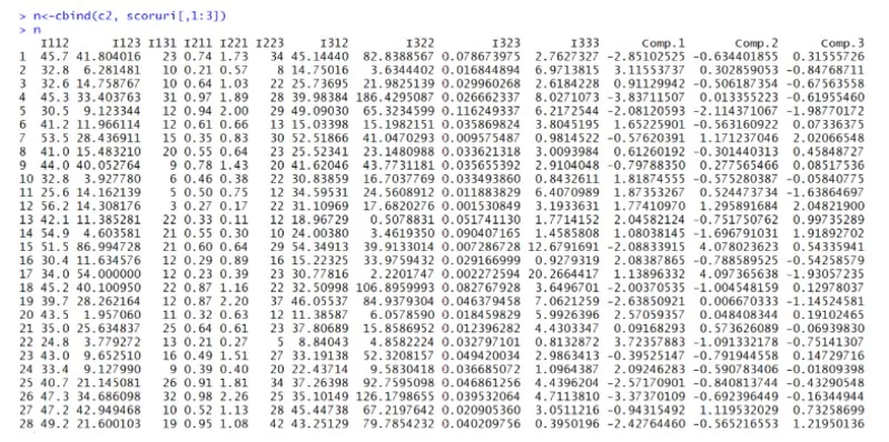
The study of dimensionality reduction is based on a sample from 2017 consisting of indicators from 28 countries:
Figure 1: The table of the indicators from 28 countries
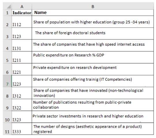
In the figure below, the name of each indicator considered in the paper is presented in details:
Figure 2: Descriptions of the name of each indicator
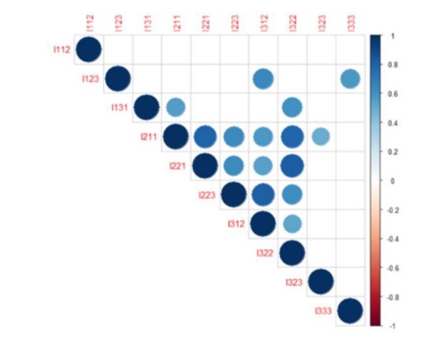
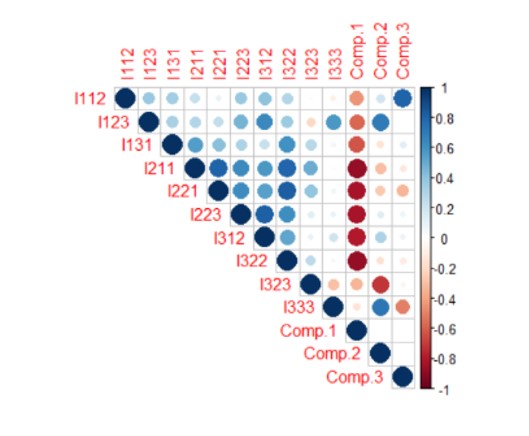
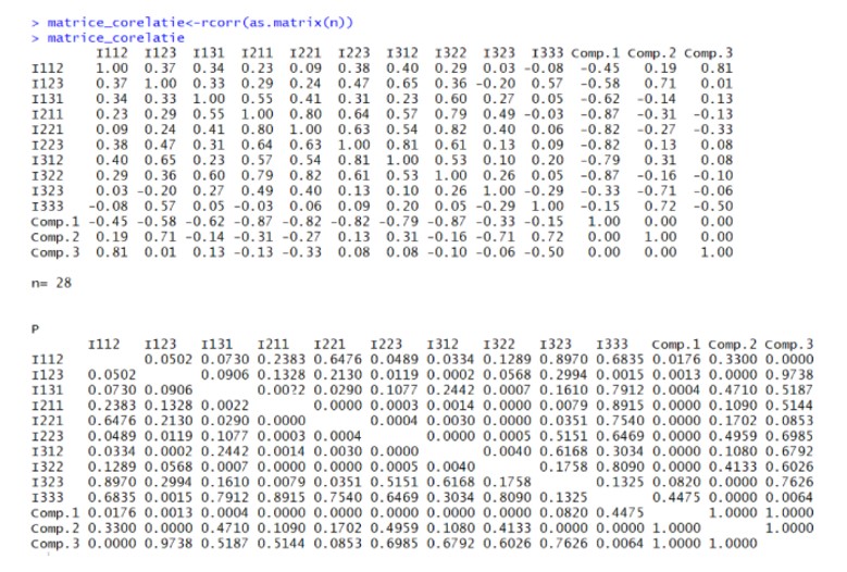
In order to perform the analysis of the chosen data set by applying the dimensionality reduction, the R Studio software was used. The first step in the analysis was to create descriptive statistics. Thus, in the figure below, the correlations between the data presented can be seen. The more the blue increases in intensity, the stronger the correlation between the indicators gets. The empty squares in the figure represent that the probability is greater than 0.05, which means that there is a statistically insignificant coefficient between certain indicators. For example, the indicator I112 (weight of the population with higher education) has very strong correlations with all the indicators in the data set:
Figure 3: The correlation matrix between the indicators
In the correlation matrix of the figure below, it can be said that there is a strong direct (positive) correlation between I211 (Public expenditure on Research % GDP) and I221 (Private expenditure on research development) of 0.80, and a strong (positive) correlation directly between I223 (Share of training companies) and I312 (Share of innovating companies) of 0.81. Further in the analysis, the correlation matrix was created using the chart. The correlation () function in the Performance Analytics package that allows the correlation chart type is to be made.
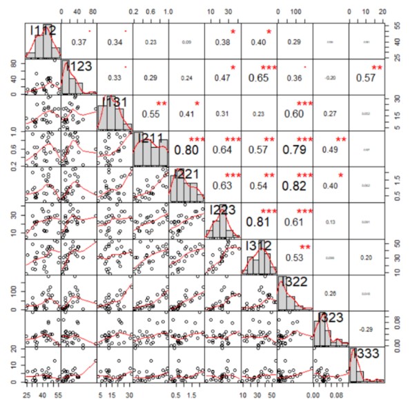
The values above the main diagonal, in the figure below, represent the values of the correlation coefficients, and the stars represent the significance levels (three stars → significant correlation coefficient, with an associated probability of 0%, two stars → less significant correlation coefficient, one star → very low correlation coefficient). The figure below also presents the histograms related to the analyzed indicators, those inclined to the left (related to I123, I131, I211, I221, I322, I323, I333) have the most extreme values to the right, and the indicator I312 has a distribution inclined to the right, with several extreme values to the left. Last but not least, indicator I112 has a distribution close to the normal one.
The graphs below the main diagonal, in the figure below, represent scatter plots detailing the relationship between two quantitative variables. For example, the first scatter plot represents the relationship between indicator I112 (weight of population with higher education) and indicator I123 (weight of foreign doctoral students). Analyzing each scatter plot, a general tendency of growth was observed, more precisely, the association between variables is positive. Also, there are countries (represented by circles) that are positioned above the average or very low below the average. These countries represent the tools of the dataset.
The Correlation Matrix Chart graph also shows the intensity of the connections between the analyzed variables, so in the 6th scatter plot, one can see a very strong connection (the dependency line is drawn at a distance of about 45 degrees) between the indicator I131 (the share of companies that have high-speed Internet access) and I211 (public spending with% GDP research).
Figure 4: The correlation matrix chart
The second step in the analysis was represented by the analysis of the main components, because following the analysis of the correlation above, it was found that there is an informational overlap. The princomp () function will be used to reduce dimensionality by approaching spectral decomposition.
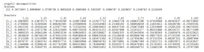
Next, the eigen values of the correlation matrix were determined:
Figure 5: Output of the eigen values of the correlation matrix
Then, the authors of this paper calculated the number of the main components that will have lambda greater than 1, complying with Kaiser’s Criterion, and observed the presence of three main components in the chosen data set, following the analysis of the variances representing the square elevation of the standard deviations of each main component.
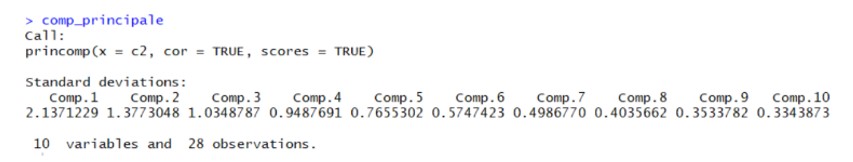
Figure 6: Output of the princomp () function
In the figure above, following the application of the princomp () function, the standard deviations of the main components were displayed, which shows the percentages of information taken by each new component created. It is also observed that the first three main components take the highest percentage of information from the data set.
Using the summary () function, the simple proportions and cumulative variance ratios of the main components resulted in R. This confirms that only the first three main components will be kept in the analysis, the standard deviation of the first component is 2.1371229, of the second 1.3773048, and of the third 1.0348787, exceeding the value 1, according to the criterion to Kaiser. It is also found that the first main component retained in the analysis accounts for 45.6% of the total information, the second holds only 18.9% of the total information, and the third holds only 10.7% of the total information.
Figure 7: The variances of the main component
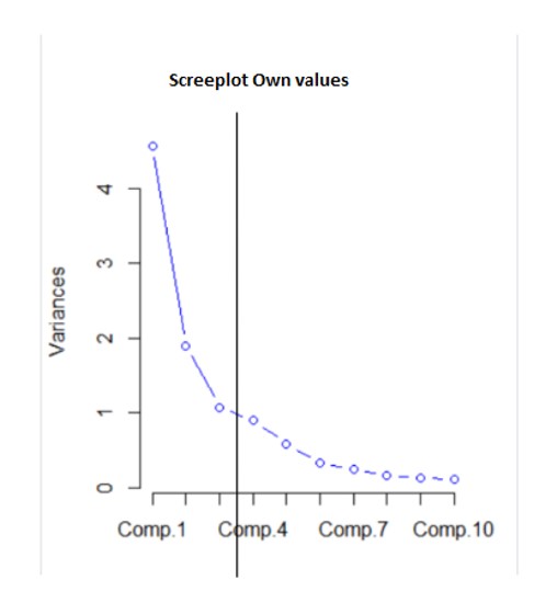
In the figure above, the three main components (Comp.1, Comp. 4 and Comp. 7) that will be kept in the analysis can been seen graphically. The results are based on the calculated values.
Figure 8: The screeplot of the main component
In order to determine the optimal number of the main components that should be kept in the analysis, a line-type screeplot was developed. In the figure above, it is observed how the eigen values decrease, thus, the first variance passes to the value 4 (variance = 4.5672943), the second variance decreases to the value of approximately 2 (variance = 1.8969684), and the third component decreases to about 1 (variance = 1.0709738). Then, the slope changes and the values reach below 1, becoming insignificant in the analysis. Therefore, only the first three main components in the analysis will be analyzed.
Figure 9: Output of the eigenvectors of the correlation matrix
In the figure above, one can observe the eigenvectors of the correlation matrix, more precisely the coefficients that are used in the construction of the main components.
Figure 10: Output of the values of the components corresponding to
each of the 29 countries
The table above shows the values of the components corresponding to each of the 28 countries, as well as the values of the indicators. For example, the value of component 1 for Germany (6th country in the dataset) is 1.65225901.
Figure 11: Correlation matrix
Figure 12: Output from R software
In the two figures above, the correlation matrix between the main components and each indicator chosen in the analysis is observed. Thus, Comp. 3 presents a strong correlation of 0.81 with the indicator I112 (weight of the population with higher education). However, in general, the informational redundancy has decreased, as a very weak correlation
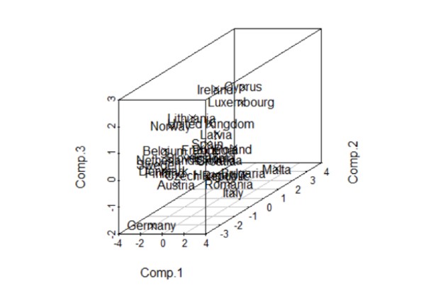
Figure 13: The three-dimensional graph
In the three-dimensional graph resulting in R Studio, using the Scatterplot 3d () command, one can see the 3 main components and the countries considered in the analysis. Thus, countries such as Finland, Belgium, Denmark and the Netherlands are grouped, more precisely; they are similar in information from the perspective of the 3 main components represented. Germany and Malta represent the outliers, and the majority of the countries are grouped above the average of the third main component, with positive values predominating, with Germany, Austria, Romania and Italy below average.
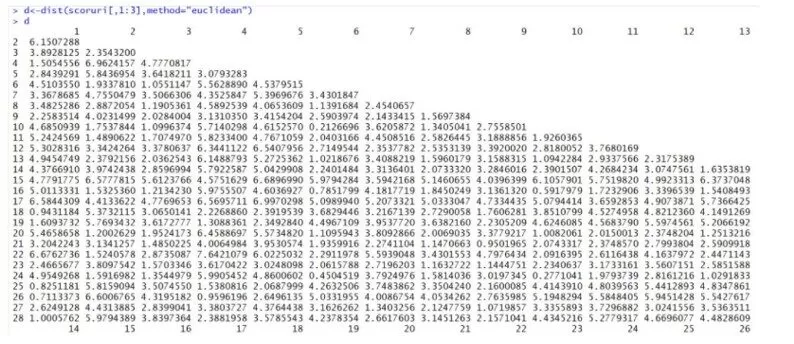
The third step of the study was to perform a cluster analysis. First, the distances between countries were calculated using the Euclidean distance as a calculation method.
Figure 14: The Euclidian methods
It can be seen from the graph of Euclidean distances above that the distance between Germany (6) and Belgium (2) is 4.51. The Euclidean distance was calculated by taking into account the main scores.
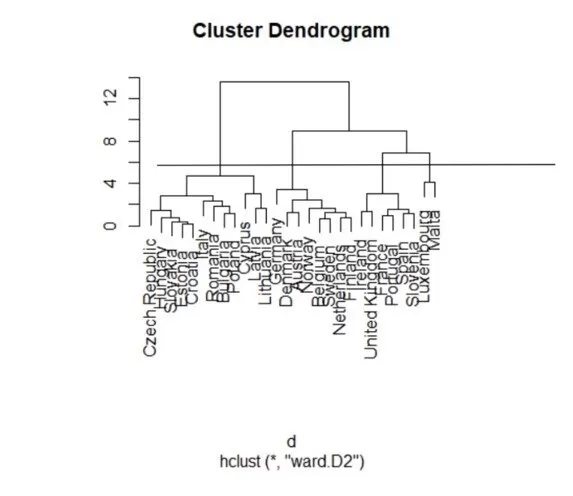
Figure 15: Ward method
In the figure above, the WARD distance was calculated, which is based on minimizing the increase in the sum of the squares of errors, after the groups are merged into one. By making a cut in the figure above, at the level of about 6, 3 clusters are obtained. The first cluster is made up of countries such as the Czech Republic, Hungary, Slovakia, Estonia, Croatia, Romania, Bulgaria, Poland, Cyprus and Lithuania.
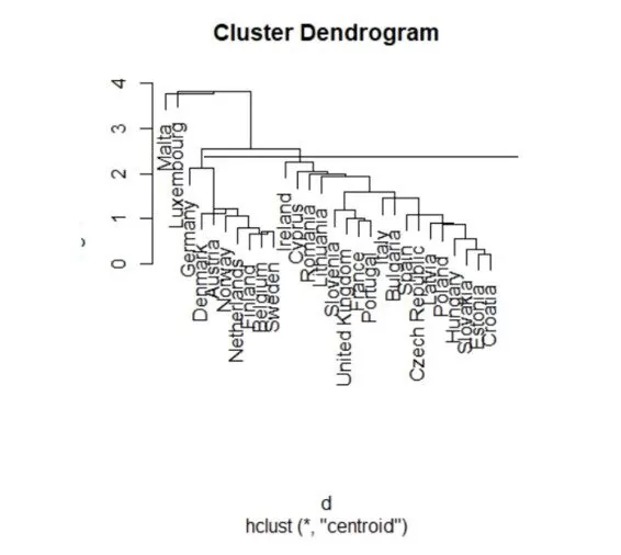
Figure 16: Centroid method
Using the centroid method, the Euclidean distances between the arithmetic averages of the components of the elements in the three groups were calculated, using the centroid of the clusters. After plotting a cut in the dendrogram, the distribution of the analyzed countries is observed in three clusters. Luxembourg and Malta are part of the first cluster, while the second cluster is made up of countries such as Germany, Denmark, Austria, Norway, the Netherlands, Finland, Belgium and Switzerland.
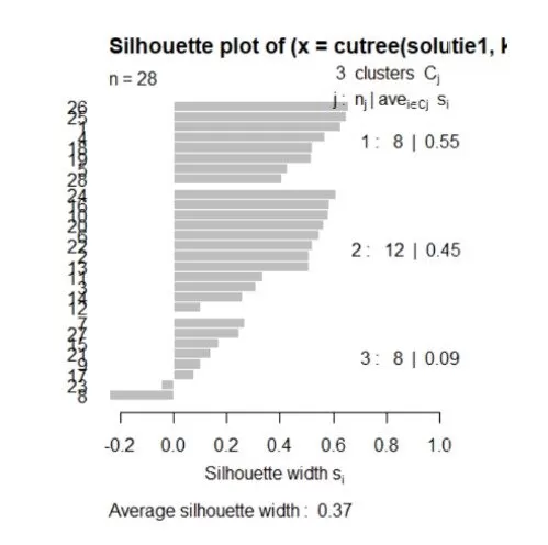
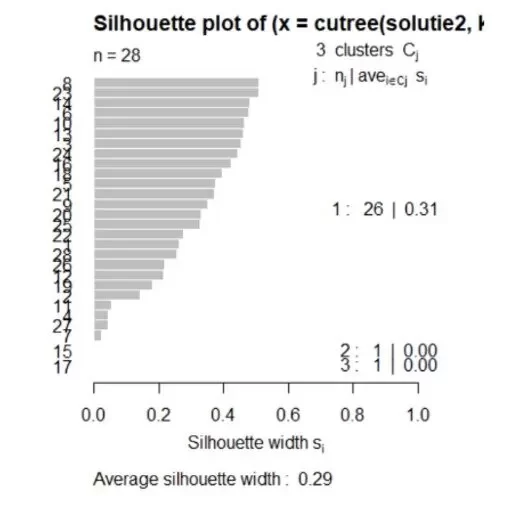
Figure 17: Silhouette plot for the Ward method
Analyzing the figure above, realized by the function silhouette () for the Ward method, it can be observed that the highest average is in the case of the division of the countries into 3 classes. Most countries which are correctly distributed (the value of the silhouette coefficient approaching more than 1) are also in the case of the division into 3 classes, but two countries will remain correctly distributed, with the coefficient of silhouette less than 0.
Figure 18: Silhouette plot for the Centroid method
Analyzing the figure above, realized by the function silhouette () for the Centroid method, it can be observed that with the increase of the number of clusters, the coefficient of silhouette decreases, but it still remains positive, therefore, the countries are distributed correctly. Therefore, the division of countries into 3 clusters is recommended.
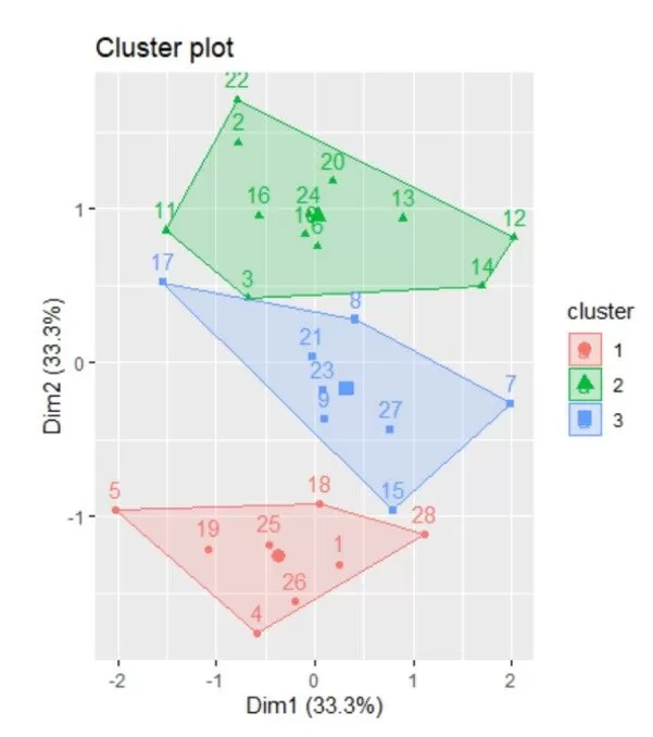
Figure 19: Cluster plot
From the figure above, realized in R Studio, the 3 clusters and the countries that form them are more clearly observed, represented by numbers. Also, the border countries, such as: 12 (Italy), 7 (Estonia) and 5 (Denmark), have small silhouette coefficients.
The use of classification trees in the analysis of the decision to become an entrepreneur
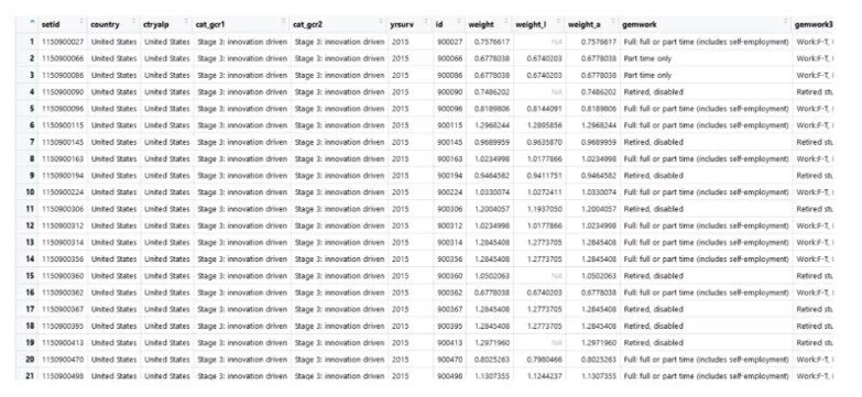
The purpose of the analysis is to see what factors influence a person’s decision to become an entrepreneur. The data set used has been downloaded from www.gemconsoltum.com and is presented as follows:
Figure 20: The table of the data set
From the total of 230 countries, Germany was chosen for the analysis because it has a higher number of records (3842), which will help in obtaining greater accuracy of the results. For the analysis the following variables will be considered:
bstart – represents the variable by which an individual wants or does not want to open a business, depending on the following features;
suskill – represents a variable by which the individual thinks he or she has competencies as entrepreneurs to open the business;
fearfail – represents the variable that registers the fear of failure, which prevents individuals from opening a business;
gender – represents the gender variable;
gemwork3 – represents the occupational status, and already has three levels;
gemhhinc – represents the income category;
knowent – binary variable – which indicates that the individual has acquaintances or friends who have opened a business;
gemeduc – a variable that represents the level of education of the individual;
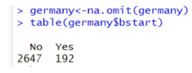
From the total of 3842, following the data cleaning process, the following division was obtained:
Figure 21: Output of R
Thus, at present, the authors have a total of 2839 registrations, of which, 2647 consider that they do not want to open a business, while 192 individuals want to open a business.
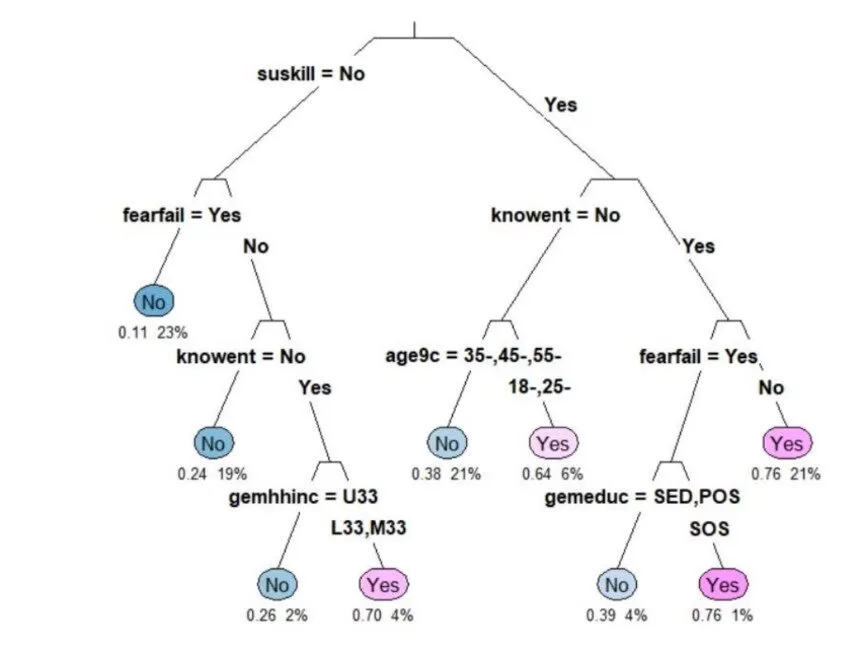
Figure 22: The classification tree
On each branch, the variable used and the level it takes can be seen (“Yes”/”No”). Only the leaf nodes are labeled, and for “type” = 3 on each branch of the tree, the variable used and the level it takes are seen. For the numerical information, it is observed that “extra” = 106 was used as well as the probability of class 2; the class “yes”, that is the weight of the observations from the total sample from the initial node to the root node. It started from 0.11 as a probability of the “no” class, meaning that a proportion of 23% of the respondents said that they were not afraid of failure. The first variable used was “suskill” whereby the individual believes in having entrepreneurial skills to open the business. It is noticeable that on the left branch, there is “No”; only those who have the answer “no” have been selected, and the no tag is associated. The tree in the previous figure shows a pale pink leaf which shows that there is a fairly low probability of 0.64; 6% as a risk of misclassification. For respondents who do not know close persons who have a business, it is found that those between 35 and 45 years old do not consider that they can open a business, whereas a percentage of 6% people consider that they can be entrepreneurs in the near future. The “plum” function was applied on the initial tree, using the minimum accepted value of the complexity parameter and obtained a new tree with the variable “suskill” in the first place of importance. Even if the “root” variable is not found on the tree, it appears in the tree with a probability of 60.4%.
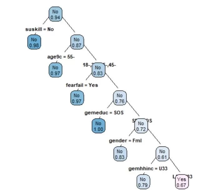
The tree below was made using the training set. It is noticeable that there is a probability of 0.98 for individuals who consider that they do not have entrepreneurial skills to open a business.
Figure 23: Training set method of the tree
Conclusions
This article demonstrates the usefulness of the analysis and analysis tools applied to the large datasets generated in the process of observing innovation in the private sector in Europe.
In the first part of the analysis, a strong correlation was observed between public spending on research and private spending on research and development. A strong positive correlation was also observed between the share of companies offering training and the share of companies that innovated.
From this first analysis, it was observed that the more training offered by companies, the more performance of a company increases. An important correlation was also observed between the share of companies that have access to high-speed Internet and public spending on research. For a clearer analysis, the principal components analysis technique and the clustered technique were used to correctly group the countries considered in the analysis from the variable point of view taken into account.
The last part of the analysis was the evaluation of the factors that influence a person’s decision to become an entrepreneur. The tree classification technique was used. Germany, having the most records in the dataset, was the country analyzed for the proposed objective.
Future analyses of this article are aimed at implementing data mining techniques by applying an online questionnaire to several countries in Europe to determine information about the behavior of individuals who want to be entrepreneurs and how to change this behavior at certain circumstances. For this purpose, a correspondent analysis and a conjoint analysis will be used.
Behera, H.S., Nayak, J., Naik, B., Abraham, A. (2019). Computational Intelligence in Data Mining. Proceedings of the International Conference on CIDM 2017, Springer;
Chiriță, N., Nica, I. (2020). An approach of the use of cryptocurrencies in Romania using data mining technique. Theoretical and Applied Economics, Volumes XXVIII, no.1(622)
Davenport T. H., Dyche J. (2013) Big Data in Big Companies, International Institute for Analytics;
Kerstholt, F., Van Wezel, J. (1976). Optimizing Social Participation over the life Cycle: Towards an integrated socio-economic theory and policy;
Kokate, U.; Deshpande, A; Mahalle, P.; Patil, P. (2018) Data Stream Clustering Techniques, Application, and Models: Comparative Analysis and Discussion. Big Data Cogn, Comput;
Lyman, P.; Hal R Varian;Swearingen, K.;Charles, P. (2003) How much information?School of Information Management and Systems, University of California at Berkeley;
Nica, I., Chiriță, N., Ciobanu, F.A. (2018). Analysis of Financial Contagion in Banking Networks. 32nd IBIMA Conference, Vision 2020: SUSTAINABLE ECONOMIC DEVELOPMENT AND APPLICATION OF INNOVATION MANAGEMENT, pages 8391-8409;
Nica, I., Chiriță, N. (2020). Conceptual dimensions regarding the financial contagion and the correlation with the stock market in Romania. Theoretical and Applied Economics, Volumes XXVIII, no.1(622);
Perner, P. (2017). Advances in Data Mining. Applications and Theoretical Aspects. 17th Industrial Conference, ICDM 2017, New York, USA, 2017 Proceedings, Springer;
Shaw, J., (2014) Why Big Data is a Big Deal,Harvard Magazine;